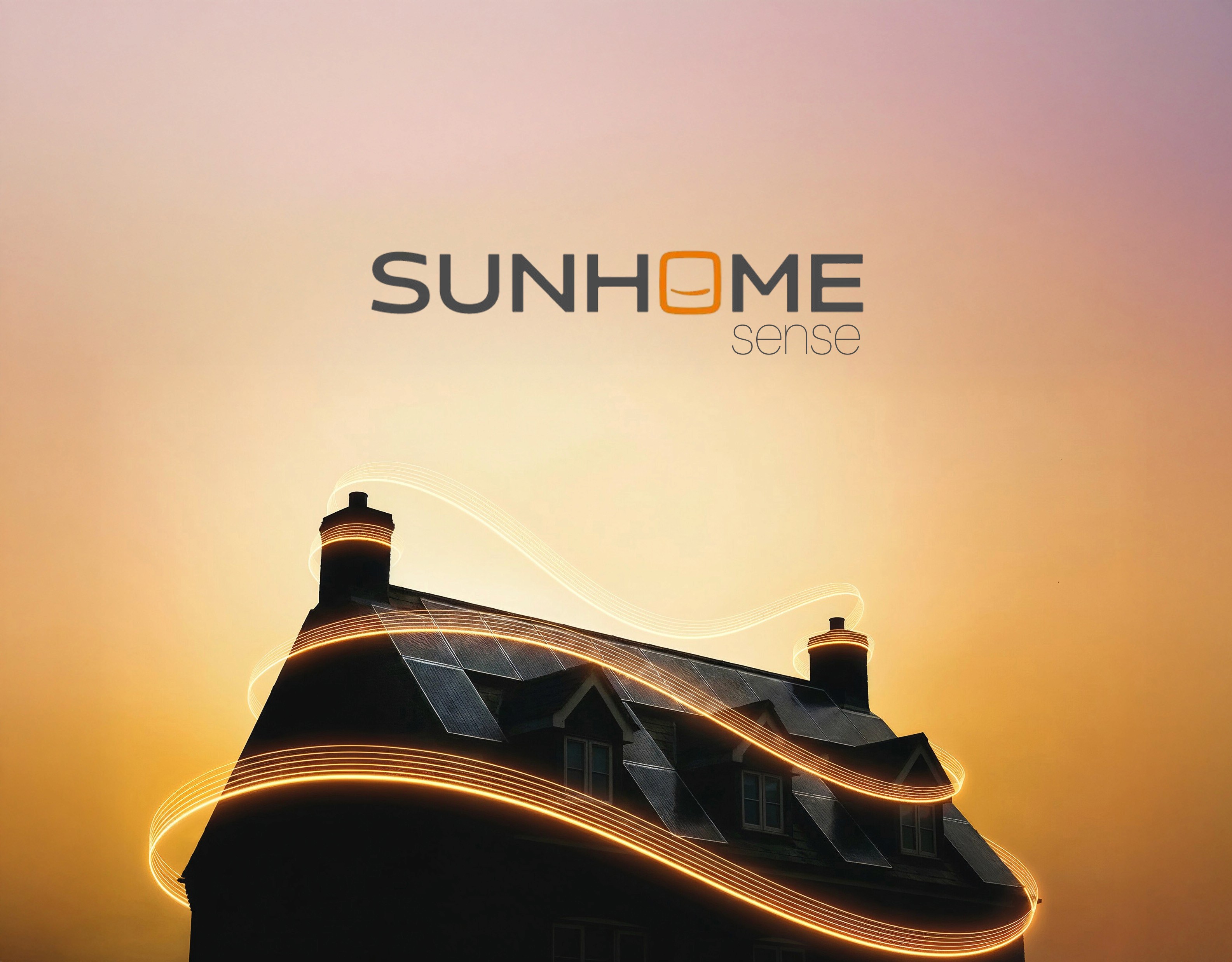

Sunhome Sense
A key part of the identity lives within the logo itself, a boxed smile nestled inside the wordmark. Simple but intentional, it adds warmth and personality while reinforcing the brand’s focus on comfort, positivity and trust. From this, we developed the positioning “Sunhome Sense” - a distilled expression of smart energy use and intuitive living. Memorable, playful and quietly confident, it shaped the tone of the brand across every touchpoint.

Brand Identity
A distinctive brand system that visualises the flow of solar energy through everyday life. Bold, dynamic and built to flex across channels, it unites Sunhome’s complete renewable energy offering under one cohesive identity.

We introduced another layer to the brand identity, using warm colourways to reflect the comfort and warmth of home, powered by energy generated through solar panels. Premium, eye-catching and diverse in application, it creates an aspirational system of visuals - symbolic of one system offering.


A logo device was introduced as a distinctive brand asset, framing key product features and guiding attention to what matters most. Bringing clarity, structure and simplicity to the customer experience - Sunhome Sense.


Even generic imagery doesn’t need to feel flat or forgettable. By finding simple, ownable ways to elevate the everyday, we make even the most mundane visuals feel distinct, considered and unmistakably Sunhome.


From colourways and key messaging through to music selection, we crafted a suite of films and static creative designed for digital channels that clearly communicate the service and its benefits. Across each piece, we weave together the different brand routes, showing how they sit in harmony, working side by side as one cohesive system.
Next projects.
(2020-26©)